
Saving £100 a month for the past 20 years would have lost you money
Bank of England, ONS and MSCI data compares 20 years of UK savings, UK inflation, and global investing. Savers come off worst.
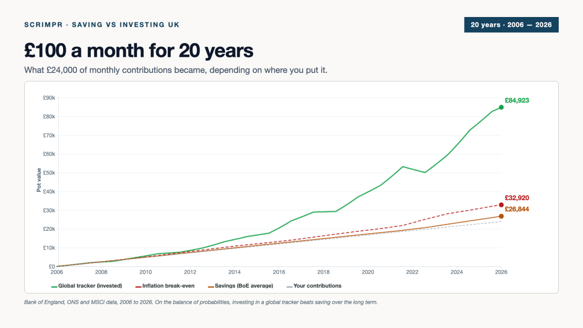
If you had put £100 a month into a savings account from June 2006 until May 2026, you would have approximately £26,844 in savings today. The same twenty years of monthly £100 contributions, invested into a global stock tracker, could have been worth £84,923. That’s a £58,079 difference. More than twice the deposit I put on my house.
I built the widget below to show what would have happened to your money under different scenarios, using real data from the Bank of England, the Office for National Statistics and MSCI. Change the start year or the monthly amount and the chart updates with the new numbers.
You put in
£24,000
£100 a month from June 2006
Inflation break-even
£33,074
What your pot needs to match the start year’s prices
If you saved it
£27,229
UK average savings rate, BoE data
If you invested it
£85,369
Global stock tracker, GBP terms
Reading the chart
The chart plots the value of your money pot, in pounds sterling, on the vertical axis. The horizontal axis runs across time, from June 2006 on the left to May 2026 on the right. Each line shows what £100 a month would have grown (or failed to grow) to under a different scenario. A line moving upward means your pot is gaining value; a line moving downward means it is losing value; a line moving sideways means it is standing still.
Over 20 years, all four lines go up on average. However, the gaps between them are huge. Most people assume that savings comfortably beats inflation, and that investing is risky enough to roughly match savings over the long run. Neither is true.
The grey dashed line at the bottom is money hidden under the couch. £100 a month squirrelled away, but never invested, never put in a savings account, never earning a penny of interest (maybe sitting in a current account). After 20 years, £100/month adds up to £24,000 of your money sitting there, no more, no less.
The amber line is the hypothetical saver. It plots what would have happened if someone had paid £100 a month into an account tracking the Bank of England’s official data for instant access savings rates (covering the major UK banks, so close to the average saver’s experience rather than “best buy” rates). The line crawls upward by £2,844 over the past two decades. After 20 years, including compound interest, you’d have £26,844. That’s £2,844 of interest, across two decades, for doing what everyone tells you to do.
The red dashed line shows what your pot would need to be worth in 2026 just to stand still. By which I mean, this is how much our hypothetical saver’s pot would need to be to buy the same things that £100 bought when it was first contributed. UK inflation rates pushed that figure to £32,920. The £8,920 gap between what you paid in (£24,000) and what you’d need to break even (£32,920) is what your money lost in purchasing power just by existing through twenty years of rising prices.
And the green line, miles above the rest, is what happened to the same £100 a month if it had been quietly drip-fed into a global stock tracker instead. Cost: pretty much identical to the savings account. Effort: identical (a monthly direct debit). Outcome: £84,923 — that’s £60,923 of growth on top of the £24,000 paid in. That is what the maths of small, regular contributions plus the last two decades of global earnings compounded actually did.
The bit that surprises people: savings lost money in real terms
The savings line ends below the inflation line. The UK average savings rate, even at its post-2022 peak, did not keep up with rising prices. Across the whole 20-year window, our hypothetical saver ended with a pot worth £6,076 less than the prices they originally aimed to keep up with. Saving wasn’t just slow. It wasn’t enough.
This isn’t a quirk of one 20-year window — but it isn’t a permanent rule either. Cash savings beat inflation comfortably during the 1980s and 90s. The period since 2008 has been different: 14 of the last 17 years have delivered negative real returns on cash, as the Bank of England held interest rates at historic lows while inflation rose. Whether that pattern continues depends on factors none of us can predict — but it’s been the rule, not the exception, for everyone who’s been working age this century.
Bank Rate from the Bank of England’s official Bank Rate history; inflation from ONS RPI series CDKO. Real return calculated as Bank Rate minus RPI year-on-year change, annual averages 1950–2026.
What about my actual savings amount?
The widget at the top of the article uses £100 a month as the example, but you can change it to whatever fits. The shape of the result doesn’t change — saving still loses to inflation, investing still pulls ahead — but the absolute numbers scale with your contribution. £50 a month halves the figures; £200 doubles them.
Whatever monthly figure makes sense for you, the gap between saving and investing exists at any contribution level — it just gets bigger or smaller in proportion.
Why investing won, even with the 2008 crash and the 2022 dip
The green line dips in each of the major crashes the period contains — visible around 2008-2009, again in March 2020 when COVID hit, again in 2022 during the inflation panic. It also recovers from each, because a global tracker holds a slice of every listed business on the planet. Some fail, some thrive. Over the past century, the global mix has trended upward through every previous crisis — though past performance is never a guarantee of future returns.
One more thing worth knowing — drip-feeding monthly is an advantage in itself. When you keep buying through a crash, your £100 picks up more shares at the cheaper price. The £100-a-month investor in 2009 was quietly buying shares at a discount that lump-sum investors had already paid for. It’s a small thing that compounds across 20 years.
What you don’t see by looking at the chart
The chart leaves out three things: tax, platform fees, and human behaviour.
Both lines are pre-tax. Held inside an ISA, none of that matters — cash or stocks and shares, everything in an ISA is tax-free. Outside an ISA, dividends are taxed, and any gains above the capital gains allowance are too.
Then there’s the cost of investing. Most platforms charge a percentage of what you hold — Hargreaves Lansdown and AJ Bell sit around 0.25% to 0.45% a year. A 0.45% fee on the investing line above would take roughly £8,000–12,000 off the final pot over 20 years. Trading 212, InvestEngine and IG charge nothing for a regular monthly investing plan. See our cheapest investment platform UK guide for the specifics.
And then there’s what people actually do. The chart assumes a monthly direct debit set up in 2006 and left running for 20 years. Real life isn’t like that — people pause contributions, withdraw money when something comes up, change tack when markets fall. None of that’s wrong. It just means the line on the chart is one possible outcome — the actual outcome for an individual investor could be higher or lower.
What this article is, and isn’t
This is information, not advice. It walks through what historical UK data shows about cash savings versus investing in a global stock tracker over 20 years, using publicly available figures from the Bank of England, ONS and MSCI. It is not a recommendation that you save, invest, or do either in any particular way.
Decisions about your own money depend on things this article doesn’t and can’t know — your age, income, debts, dependents, tax position, time horizon, existing savings and pensions, attitude to risk, and personal goals. The responsibility for those decisions sits with you.
If you want to take any next step, the route to do it properly depends on what kind of support you need:
For general consumer information about investing, ISAs, pensions and how the UK system works, MoneyHelper is a free service backed by the UK government. The FCA’s consumer pages cover the same ground from the regulator’s perspective.
For personal advice on what you should do with your money, you need a regulated financial adviser. The MoneyHelper directory lists them, as does Unbiased. Regulated advisers carry a specific legal duty to give you advice that suits your personal circumstances. Scrimpr is not a regulated financial adviser, and does not give personal financial advice.
For comparing the cost of UK investment platforms if you decide to do it yourself, Scrimpr’s cheapest investment platform UK guide compares them on cost.
Investments can fall in value as well as rise. Past performance is not a guide to future returns.
Sources and methodology
- Savings rate: Bank of England series IUMTHAK (monthly average interest rate on UK instant access deposits from households) for 2006–2010, then series IUMB6VJ (monthly average interest rate on UK instant access deposits including unconditional bonuses) for 2011–2026. IUMTHAK was discontinued by the Bank after December 2012, hence the splice.
- Inflation: UK Consumer Price Index (CPI) 12-month rate, year-end, from the Office for National Statistics.
- Global stock returns: MSCI ACWI Net Total Return Index, USD returns from MSCI’s published factsheets, converted to GBP using historical GBP/USD exchange rates. Real fund returns (e.g. Vanguard FTSE All-World ETF) track within a fraction of a percent.
- Simulation: £100 paid into each pot on the first of every month from June of the chosen start year to May 2026. Annual rates applied month-by-month as compound monthly equivalents.
Data is refreshed at the start of each month as the Bank of England publishes the previous month’s savings rate. Data current as of 15 June 2026.